
We built the Global Design System from the ground up, unifying UX across 11 countries and supporting 100+ products, blending global consistency with local design needs
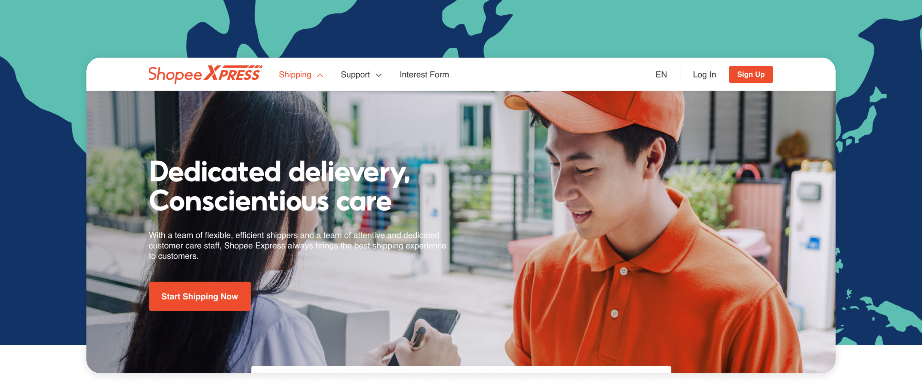
Shopee
Long term project
UX/UI design,
Design System documentation,
Accessibility design
10 Designers,
10 FE Developers,
2 BE Developers
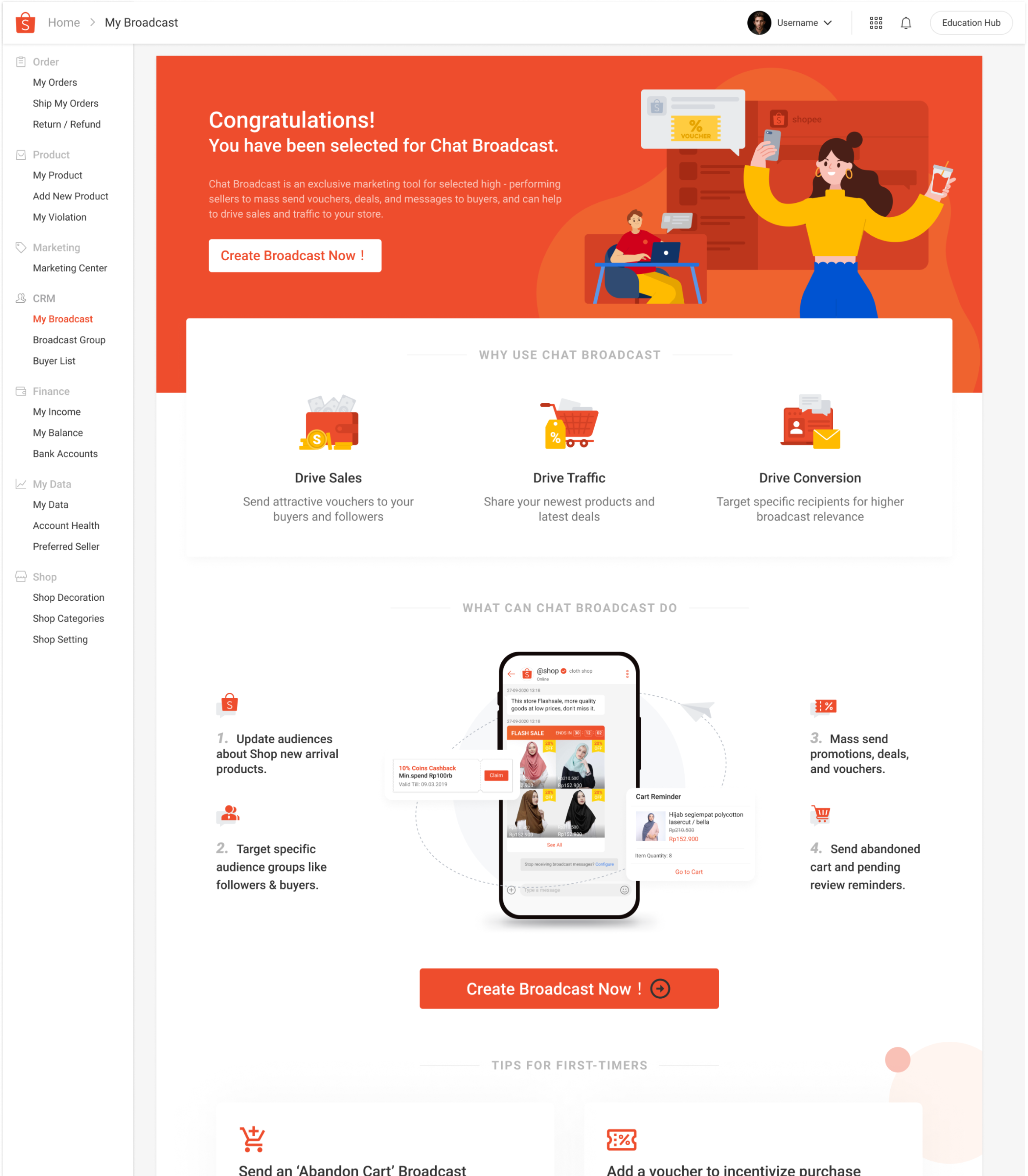
Through 2019, Shopee faced challenges with a fragmented user experience across its international operations. With no formalized design system in place, each of the 11 global markets operated with its own set of UI standards and practices, managed by separate teams and external agencies, leading to a lack of cohesion in our 100+ products.
Inconsistencies in product designs
Duplicated components
Conflicting guidance
Agile pressure without research
Siloed teams with disjointed communication
With a large team of 67,000 in 11 countries, we needed a system to effectively address diverse cultural and linguistic needs.
To adapt to varying accessibility laws in different markets, we centered our system on the Web Content Accessibility Standards (WCAG 2.1).
With a portfolio of over 100 products at Shopee, ensuring the maximum flexibility of components within an agile framework was imperative for delivering patterned solutions.
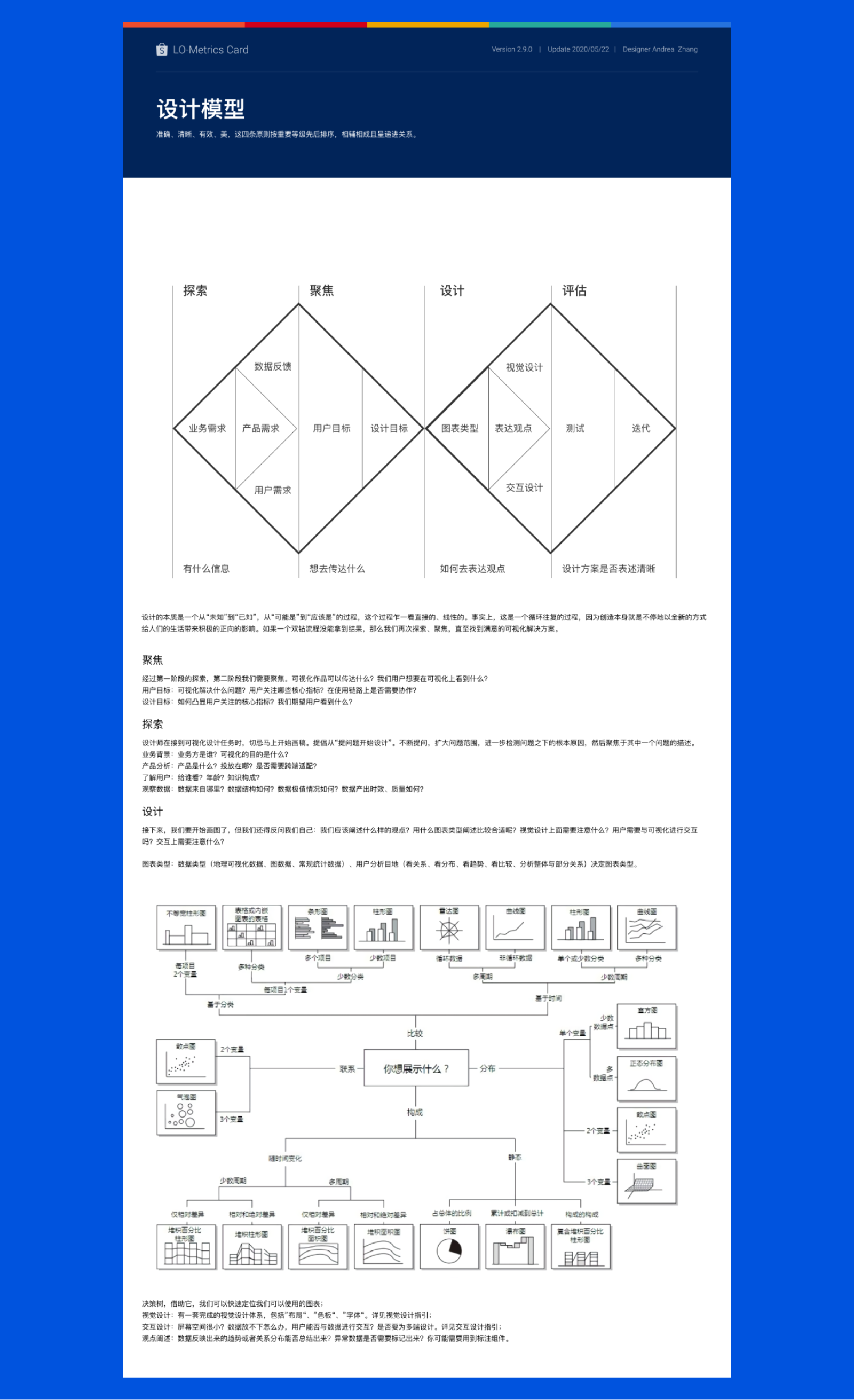
The key to the Design System’s success lay in getting all our teams on the same page regarding the essential elements for each product and country. It was designed to be adaptable to each country, requiring our basic system to cover every possible UI element. Our foundational setup accommodated our brand logos, grid systems, spacing scale, typography scales, color systems, and interactive language.
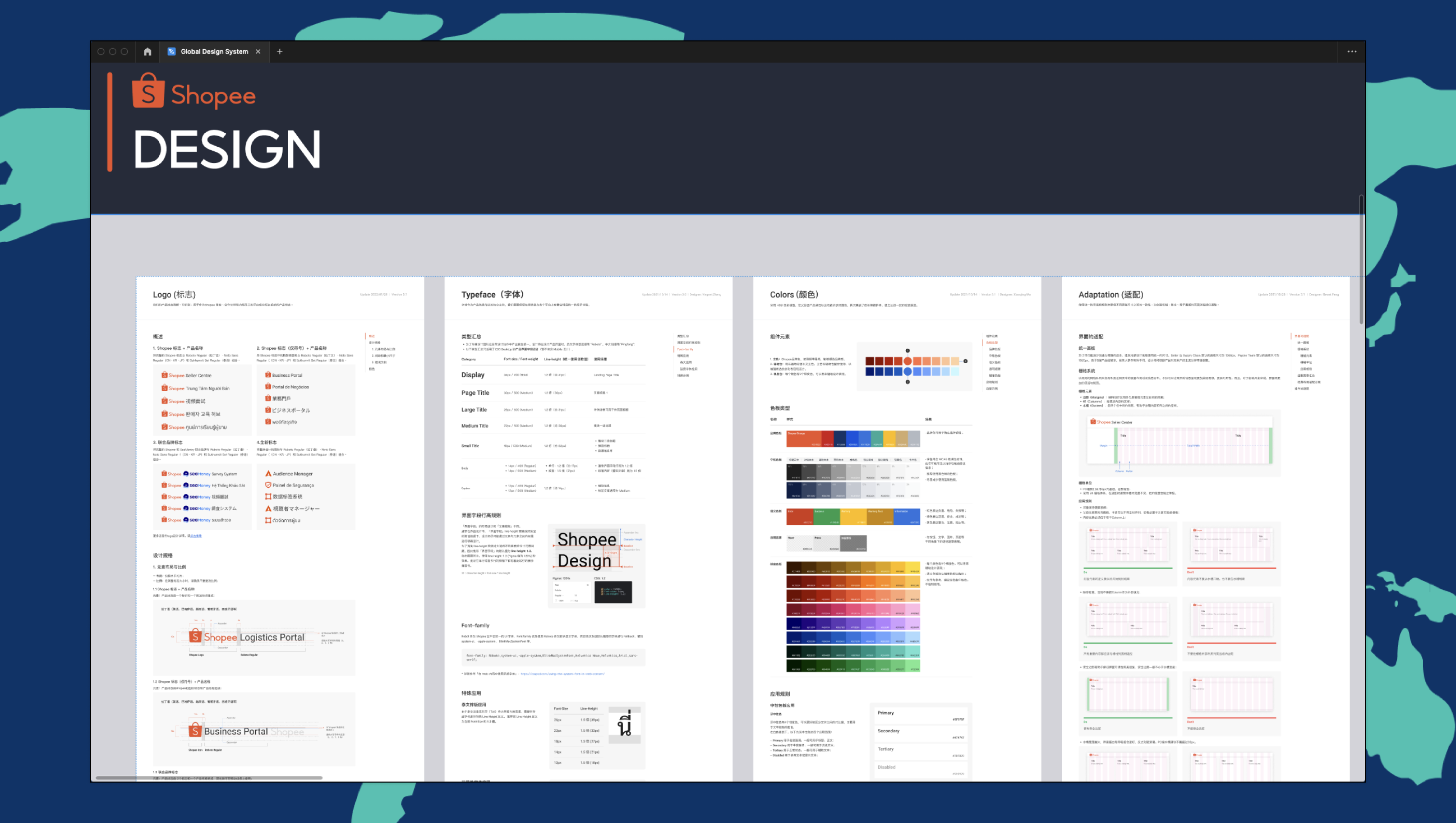
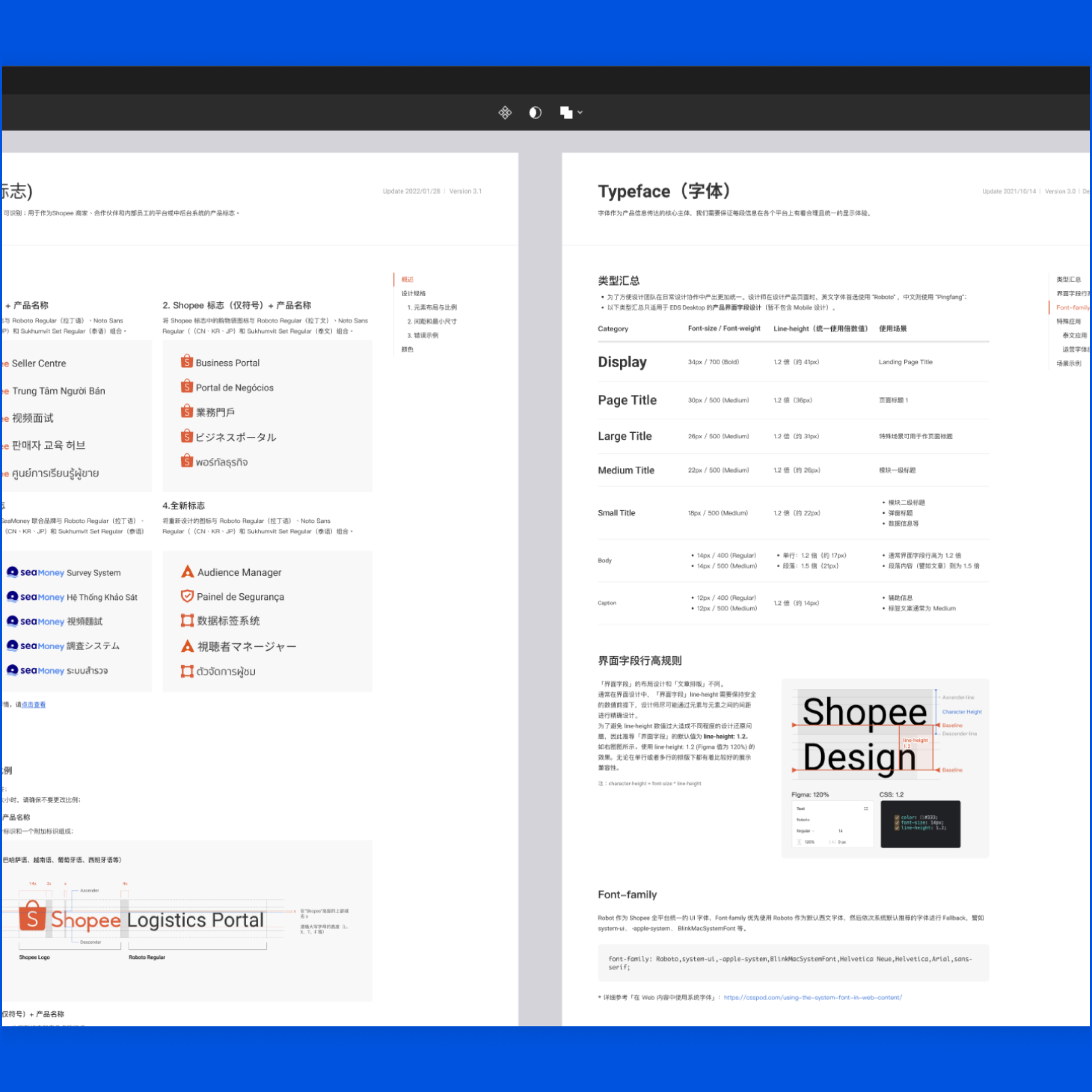
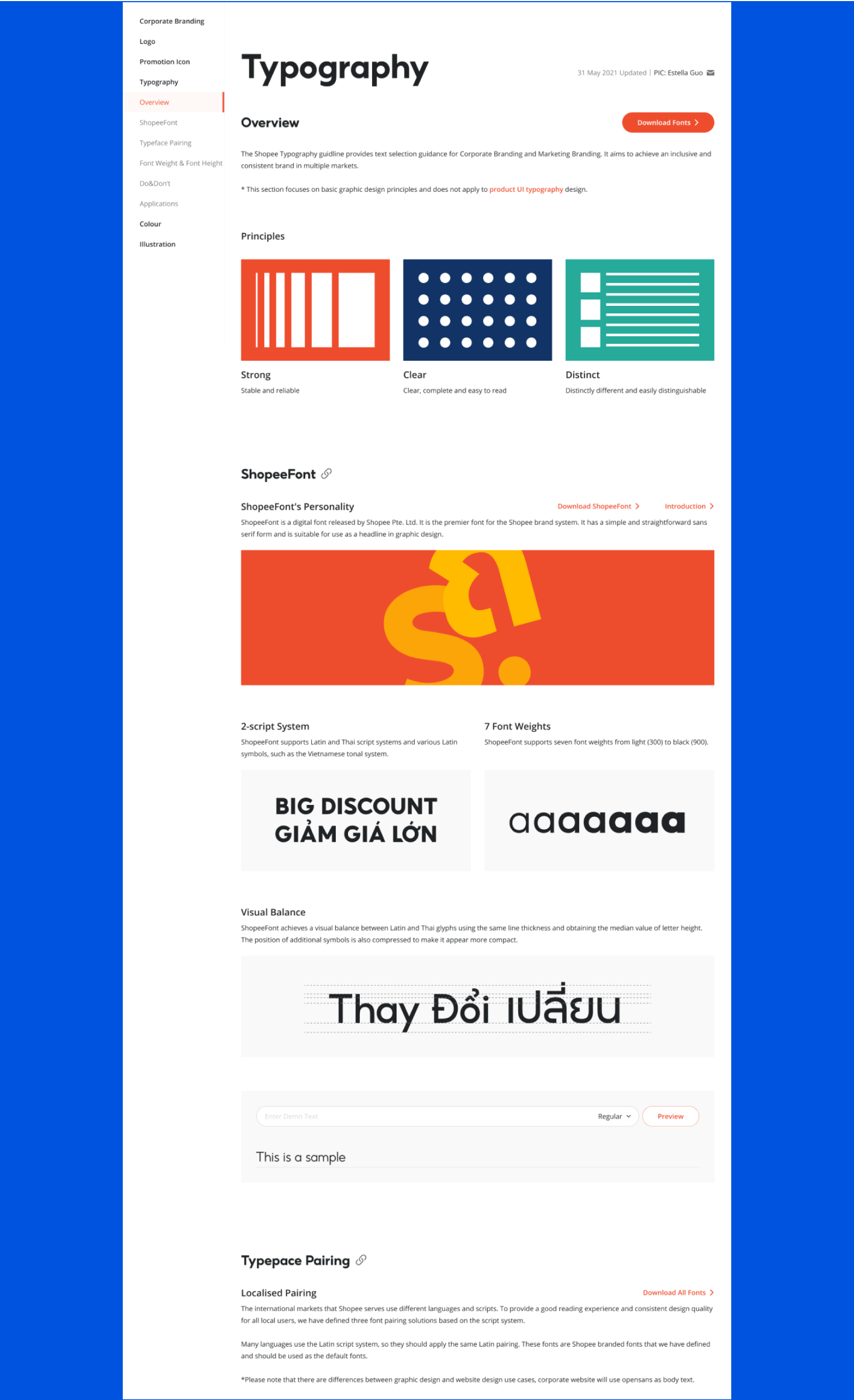
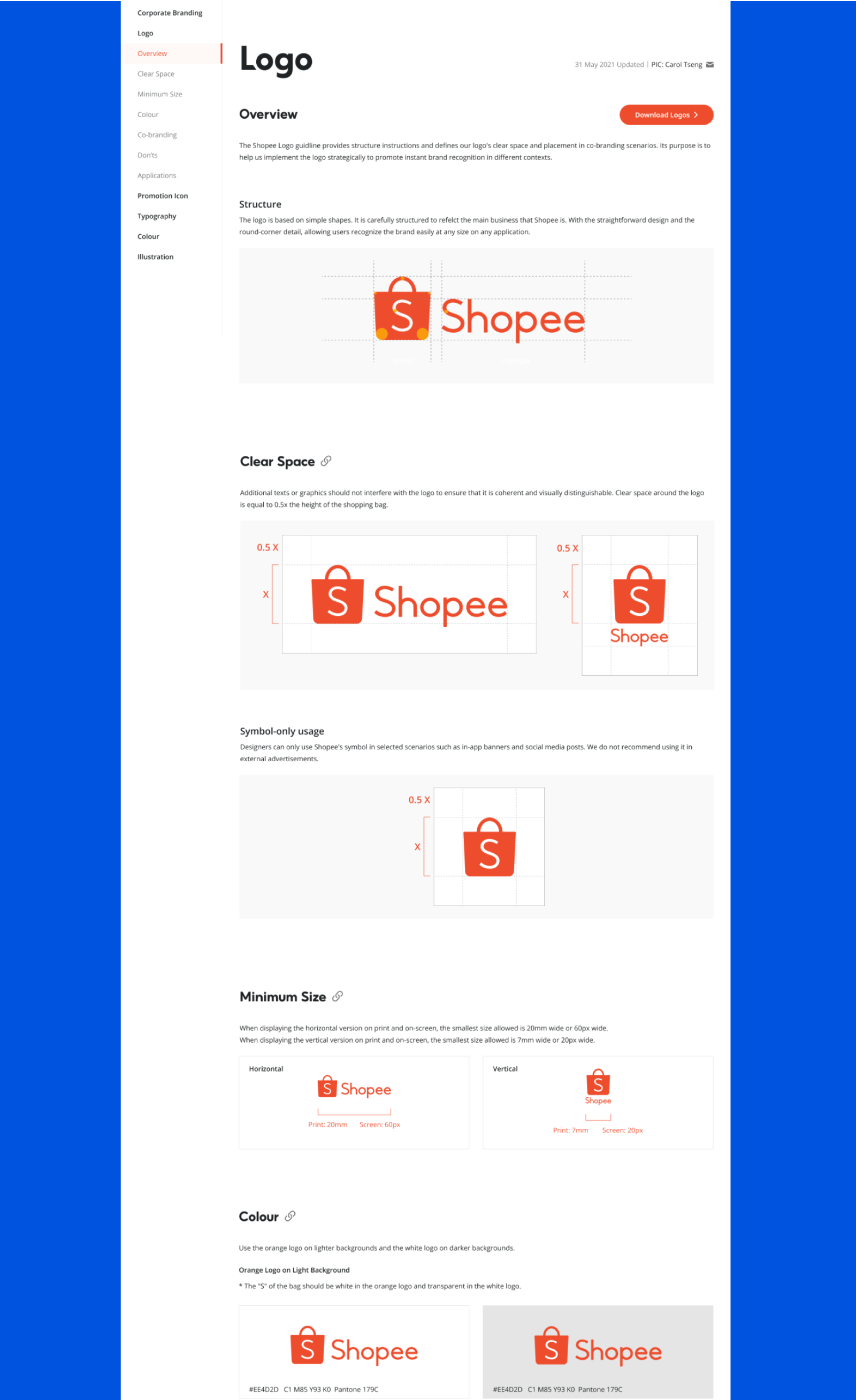
We created a flexible and recognizable logo system for our design framework, adaptable to over 100 products in 11 global markets. This ensures consistent brand integrity and recognition worldwide. Our typography uses a typescale with display and utility headings, paragraph, and supporting styles, ensuring clear and accessible text across platforms for readability and visual harmony.
We tailored our color system to include versatile light and dark brand variations, ensuring accessibility with high-contrast global palettes. Our action in designing a flexible grid system guarantees that our designs are effectively displayed on diverse screen sizes internationally, upholding visual consistency and quality across markets.

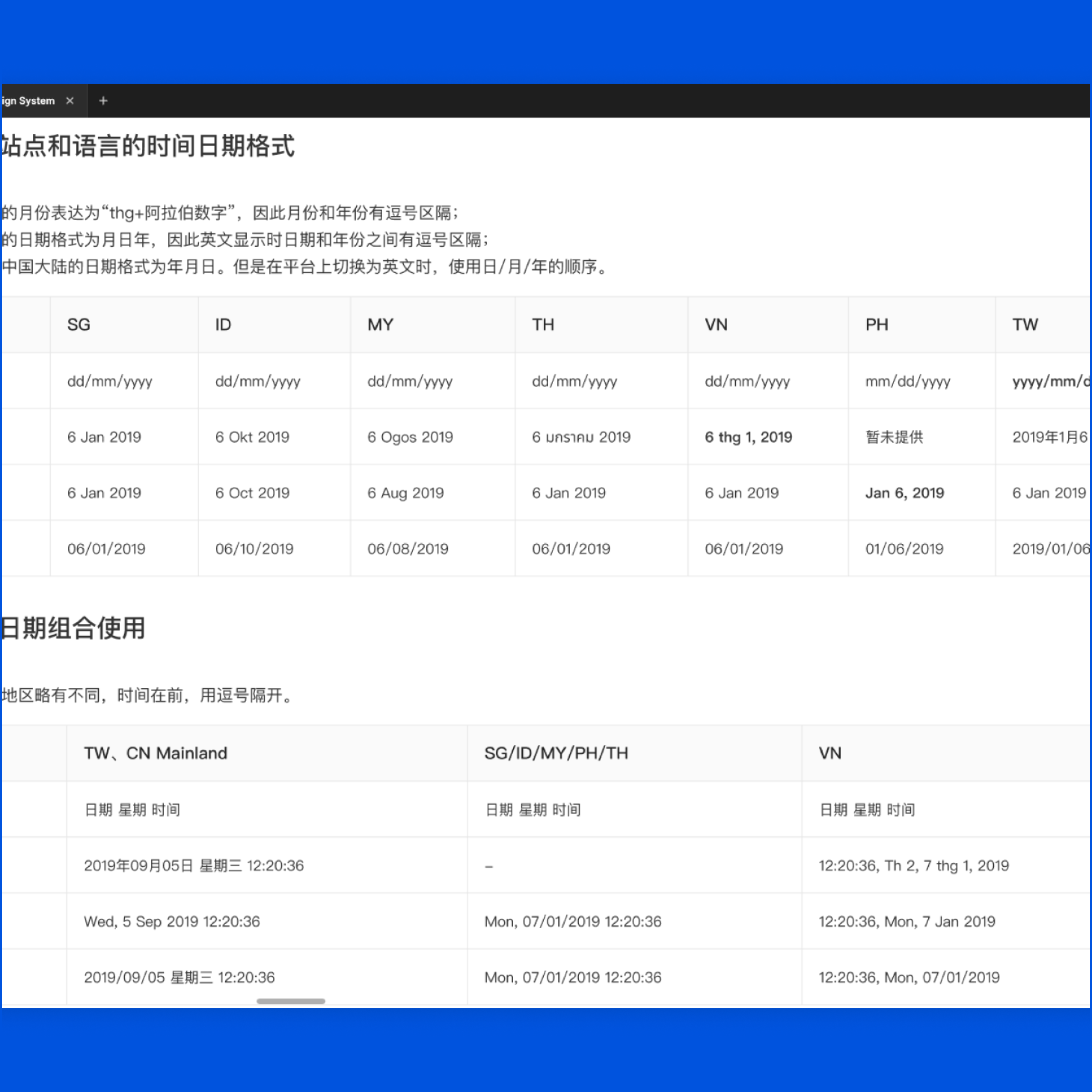
In our localization efforts, we adapted key elements like date and time formats to suit regional preferences. Additionally, we designed our UI to flexibly handle the varying text lengths of different languages, ensuring clear and comfortable readability across all markets.
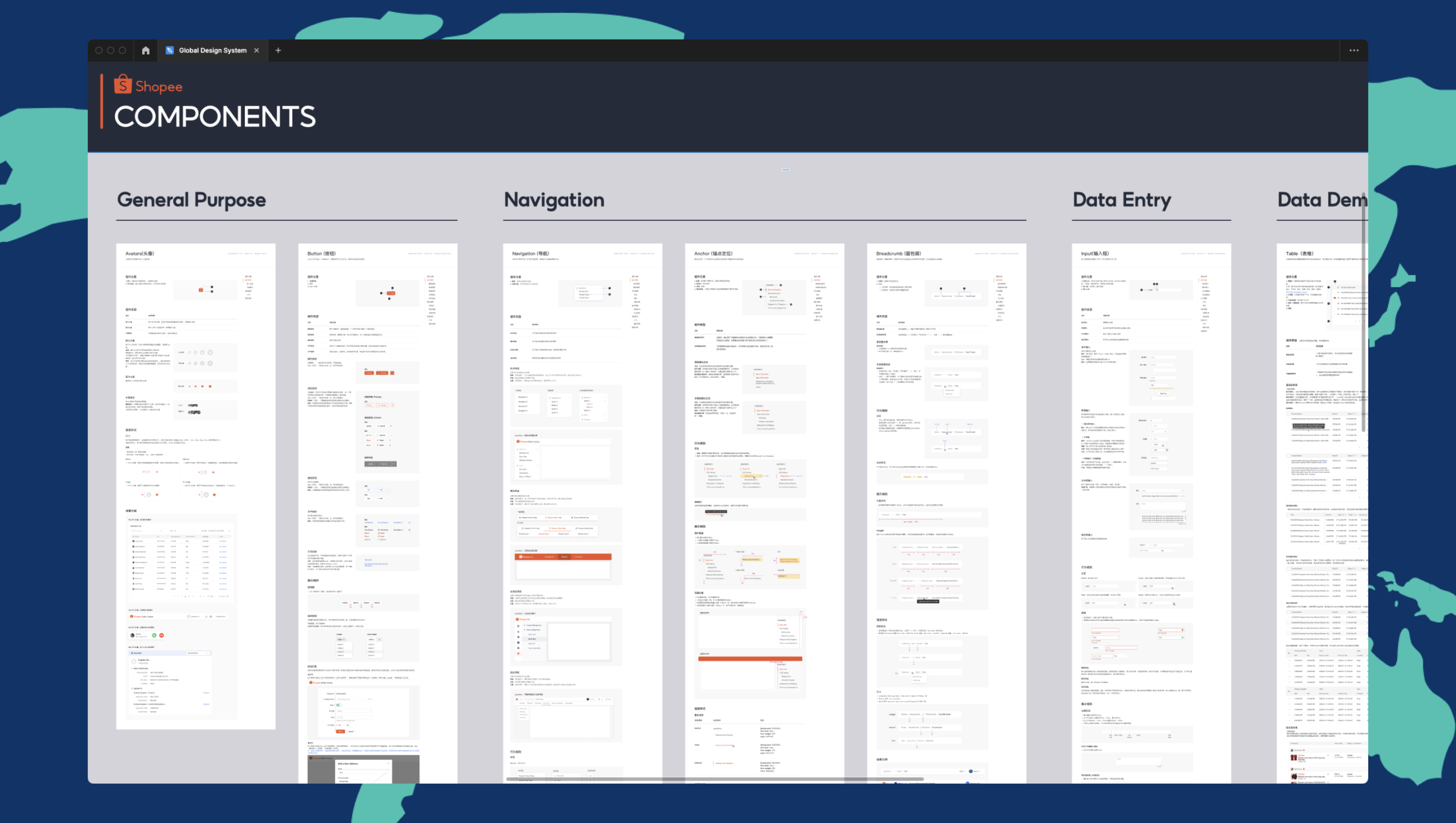
Each brand is equipped with a component library, tailored by their foundational style. We categorize components into global, structural, content, data, and utility types, emphasizing their distinct roles. This classification is crucial for efficient, context-appropriate design decisions, ensuring accuracy and coherence throughout our web pages and interfaces.
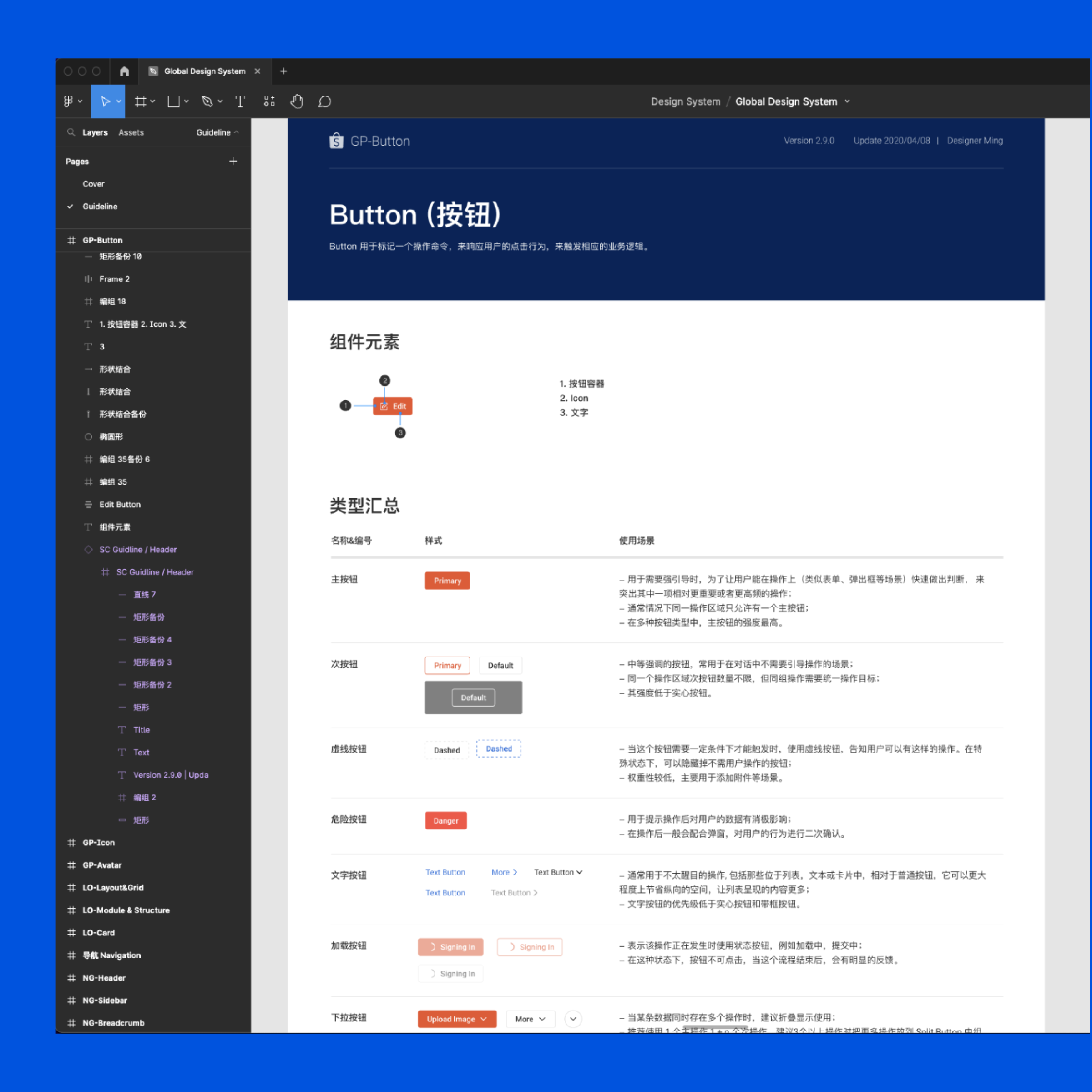
Each component includes interaction examples, specifications for keyboard control and spacing, and a breakdown of elements. It also covers component types, interaction states, and visual guides, along with scenario examples, aiding designers in effectively applying these components
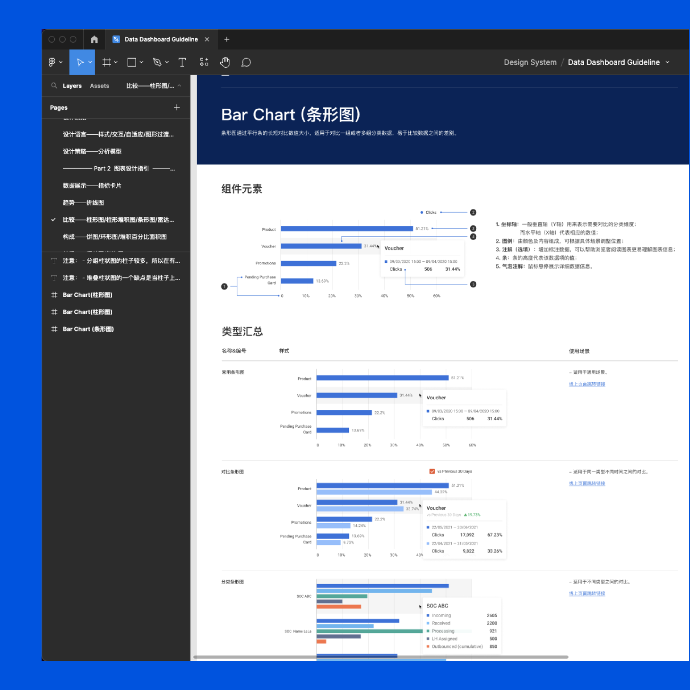
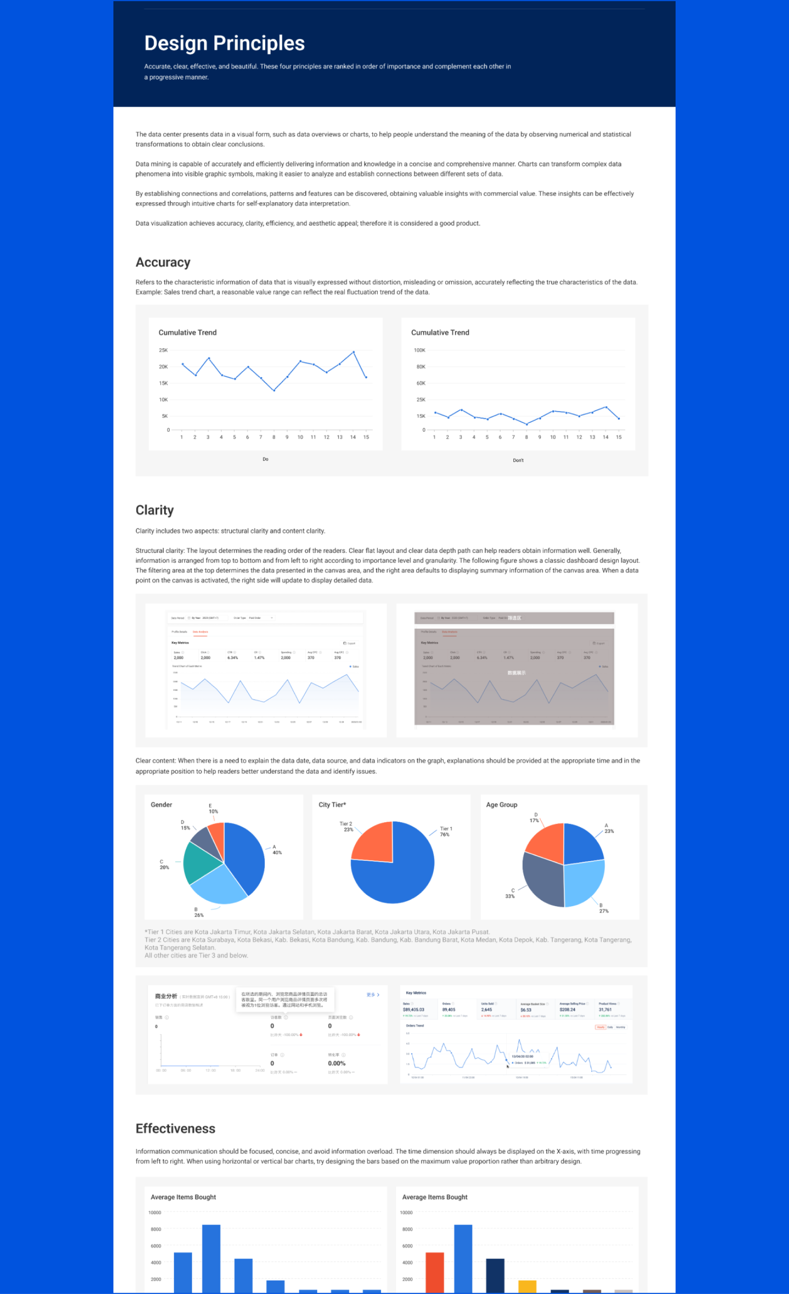
For our data visualization and dashboard components, we've provided in-depth documentation that includes specific guidelines for data representation, layout configurations, and interactive elements. This detailed guidance ensures designers can create clear, intuitive dashboards that effectively communicate complex data, enhancing user comprehension and interaction with our data-centric products.
Our Design System Team emphasized the importance of thorough documentation and governance for our design system's success. Collaborating with designers, content creators, and developers, we compiled key resources in a Confluence space. This included essential design principles, quick start guides, accessibility standards, design and testing best practices, and brand-specific governance documents, ensuring consistent and sustainable implementation of our design language.

We used comprehensive documentation to collaborate with front-end developers on our online design system. This shared resource detailed design specs and code guidelines, ensuring a seamless translation from design to functional code and fostering effective teamwork in the digital development process.

My contribution to the global design system played a pivotal role in transforming our product design and development, achieving unprecedented consistency and efficiency across our international portfolio, a milestone I take great pride in.
Design Efficiency
SUS Score
Supporting Products

